
Behind the Frame / Places / 036
Colour held in darkness
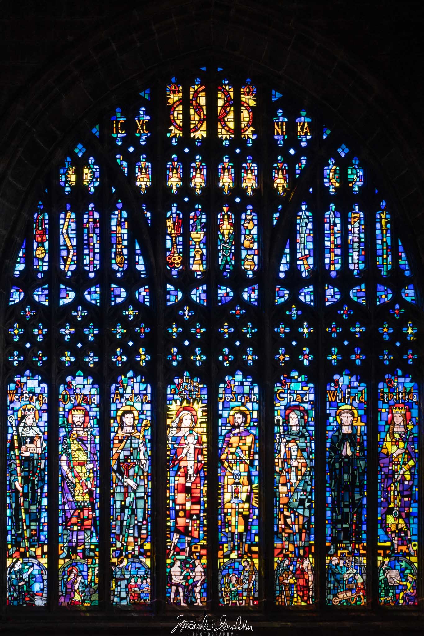
A stained-glass window becomes a field of luminous fragments. The dark spaces are doing as much compositional work as the colours.
01 / The message
The story
I see in it.
I see the blue fragments first, then the warmer figures lower in the window. The dark framework separates the pieces so that I can move through a very detailed surface without everything merging into one bright patch. Darkness gives the colour its structure.
For me, the photograph is less about describing the whole room than about the experience of looking into this illuminated pattern. The surrounding interior almost disappears. That concentration makes the colour feel contained and precious, while leaving the surrounding space largely to my imagination.
02 / Technique serving the idea
Reading the
technical choices.
The recorded settings are 70mm, f/4.5, 1/200 sec and ISO 200. Many individual glass sections remain distinct, but the brightest pale pieces deserve a closer check. The dark stone is visible in places without demanding equal attention to the window.
Clipping previews in Lightroom Classic identify extreme tonal values. [1] I would check the brightest panes before increasing their intensity. Lifting every surrounding shadow would change the picture's emphasis; I would keep enough darkness for the illuminated pattern to remain the clear subject.
Keep & build on
Darkness as a framework
The stone divisions organise many small areas of colour. They allow intricate detail to remain readable at the scale of the whole window.
Colour in repeated units
Small blue, yellow and red shapes repeat across the surface. Their rhythm links the upper patterns with the larger figures below.
A complete upward movement
The tall format follows the window towards its pointed arch. The composition feels built around the subject's own shape.
Question & explore
The brightest pale panes
I would inspect their texture and colour at a larger size. Additional brightness should not make separate pieces collapse into indistinct white areas.
Space around the arch
The dark upper margin helps complete the window's outline. I would compare a little more breathing room with the current close framing before tightening it further.
The lower edge
The base sits near the bottom of the picture. A small framing adjustment could make that boundary feel more deliberate while retaining the full design.
One practical next step
An experiment
to try.
Photograph a translucent patterned object against light, keeping the framing fixed. Make exposure comparisons that prioritise the bright pattern, then compare how much surrounding darkness you want to retain. Judge colour separation and shape before judging overall brightness.
Technical references
These sources support the marked technical explanations. The composition readings and experiments are my reflections.
Readers’ thoughts
Approved comments only · Shared across the English and Italian versions