
Behind the Frame / Places / 007
Order and traces
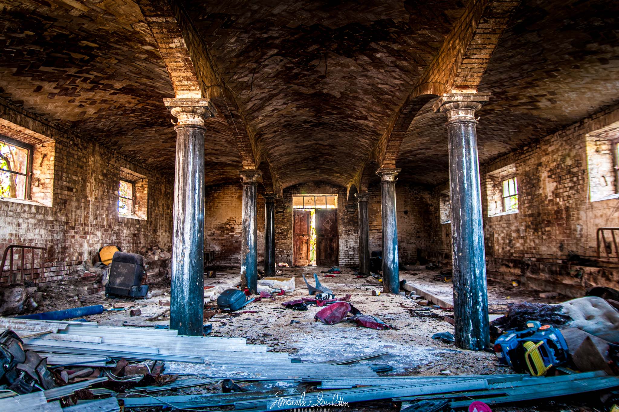
Repeating arches offer a clear route through a room filled with competing details.
01 / The message
The story
I see in it.
The architecture offers order: arches, columns and a door at the far end. The material across the floor interrupts that order. I read the picture through the tension between a strong structure and a complicated surface.
I do not need to attach a history to the room to find that contrast interesting. Its visible traces are enough. My question is how much detail helps me explore, and when it begins to slow the journey through the photograph.
02 / Technique serving the idea
Reading the
technical choices.
The JPEG records 18mm, f/2.8, 1/13 sec and ISO 200. These are recorded settings, not evidence of how many exposures or editing steps produced the final image. The converging rows and repeated arches are the visible structure I would assess first.
The room has emphatic texture and strong colour contrasts. In Lightroom Classic, local masks can isolate adjustments; Clarity changes local contrast. [1] I would compare a quieter foreground against this detailed rendering. I would also inspect the bright window areas using the histogram and clipping indicators before judging recoverable detail. [2]
Keep & build on
Repetition creates a route
The arches and columns take my eye towards the centre of the room.
Warm and cool areas interact
The warmer brick overhead and cooler columns and floor create distinct visual layers.
The floor gives context
The scattered material complicates the scene in an interesting way. I would not remove all of that information.
Question & explore
A clearer first step
The closest details compete strongly. I would test a quieter tonal treatment there so the central route remains easy to enter.
Bright side windows
My eye repeatedly leaves the central door for the windows. I would compare their visual weight without forcing them to look dim.
The balance of symmetry
A small change of camera position in a similar accessible space could clarify the alignment. I would compare it against the less formal feeling of this frame.
One practical next step
An experiment
to try.
Make a comparison version with a slightly gentler foreground, leaving the rest unchanged. Show both briefly at the same size and ask where the viewer looks first. Use that observation to decide how strongly the floor should compete.
Technical references
These sources support the marked technical explanations. The composition readings and experiments are my reflections.
Readers’ thoughts
Approved comments only · Shared across the English and Italian versions