
Behind the Frame / Still life / 028
A carousel made of colour
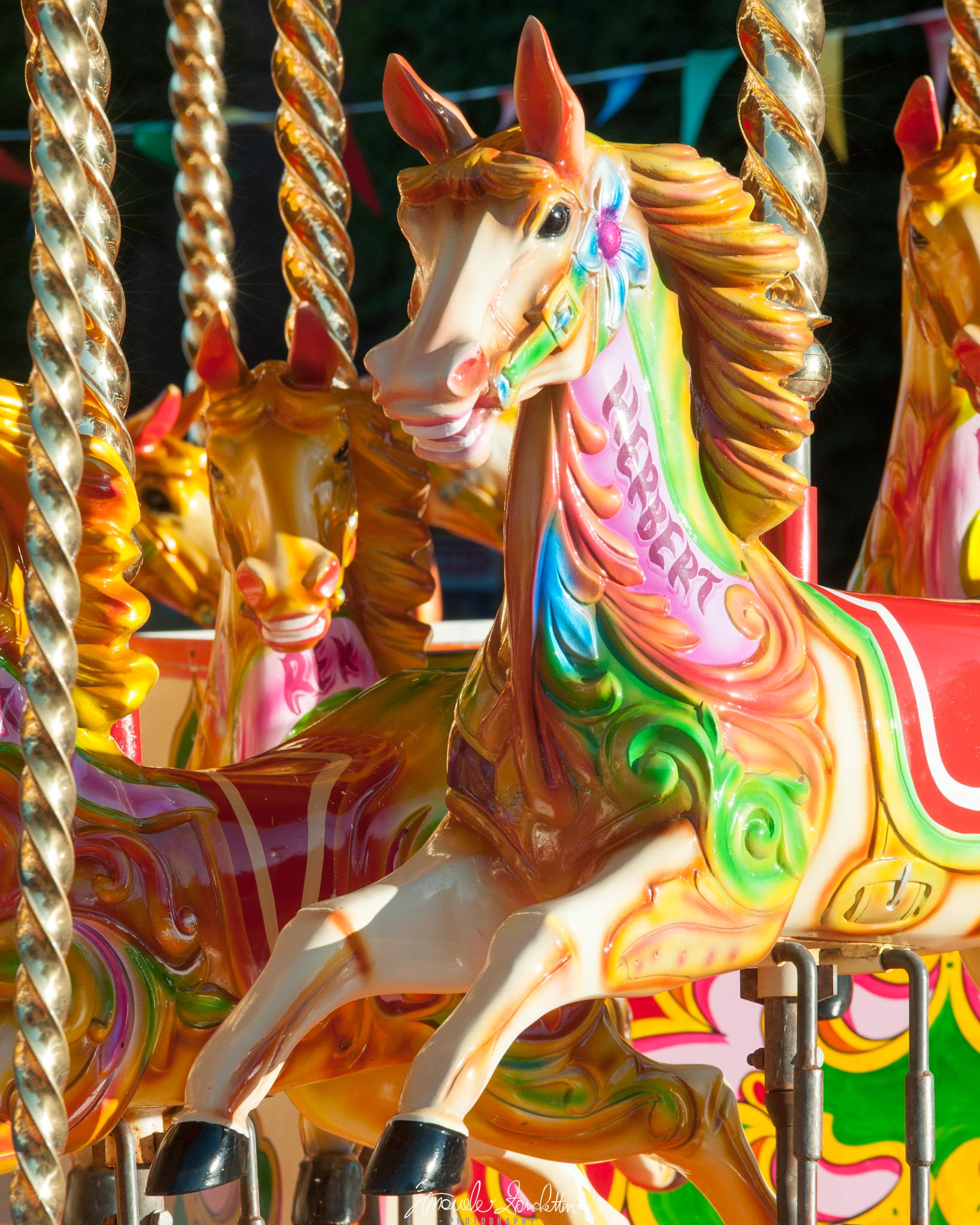
Painted horses and shining poles fill the frame. The challenge is to keep the exuberance while giving the eye somewhere to settle.
01 / The message
The story
I see in it.
The nearest horse seems to surge forward. Its raised legs and swept mane supply the gesture. Around it, repeated horses and poles create the visual equivalent of a busy fairground sound: several things calling at once.
I like that abundance. Simplifying everything would remove much of the picture's character. My question is how to keep the excitement while making the nearest horse an unmistakable lead subject, so that the surrounding detail feels like an ensemble rather than a competition.
02 / Technique serving the idea
Reading the
technical choices.
The recorded settings are 180mm, f/8, 1/250 sec and ISO 200. The front horse is clearly described and the smaller horse behind remains readable. Several bright reflections on the poles sit close to the face, which makes tonal organisation particularly relevant here.
Lightroom Classic's histogram and clipping previews help check highlight limits. [1] I would examine the brightest paint and metallic reflections before changing their brightness. Some sparkle belongs in this photograph; the useful test is whether I can still read the main horse's shape, not whether every bright point has been subdued.
Keep & build on
A strong leading character
The large pale face stands apart from the smaller horses. Its scale gives the eye an initial subject among many competing details.
Repetition with differences
The horses repeat the same idea at different sizes and positions. Their overlap gives the frame depth and a sense of abundance.
Colour that suits the subject
Gold, pink, green and blue make the photograph energetic. Their variety feels connected to the decorated surfaces rather than arbitrary.
Question & explore
Face against the poles
A small change in viewpoint could separate the ears and mane from the shining supports. I would look for clearer gaps without emptying the frame.
Bright paint on the body
The pale chest and forelegs are conspicuous. I would compare their prominence with the face to decide where the picture should begin.
Partial horses at the sides
The cut-off shapes create bustle, but each needs a reason to stay. I would inspect both vertical edges carefully before taking another frame.
One practical next step
An experiment
to try.
Find a group of colourful stationary objects and choose one as the lead subject. Make one packed composition and one with slightly clearer gaps. Keep the colour treatment consistent, then compare whether the busier version adds energy or merely makes the subject harder to find.
Technical references
These sources support the marked technical explanations. The composition readings and experiments are my reflections.
Readers’ thoughts
Approved comments only · Shared across the English and Italian versions