
Behind the Frame / People / 041
A portrait in three textures
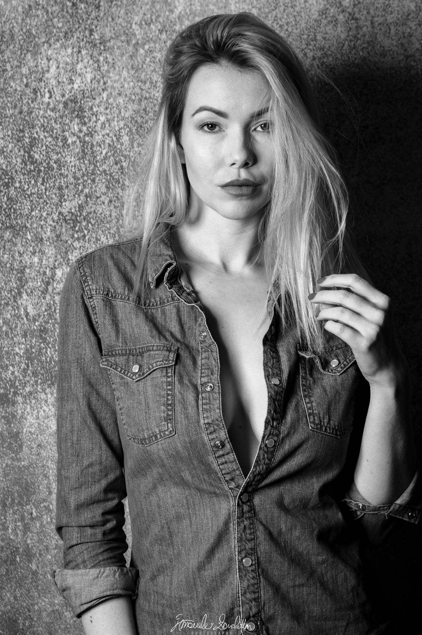
Skin, denim and a textured wall share a monochrome frame; the face still needs to lead.
01 / The message
The story
I see in it.
I meet the eyes first, then notice the hand beside the hair. Those two points make a quiet exchange within the frame. The wall is close and textured, but the portrait still feels centred on a person rather than a location.
The monochrome rendering lets me compare surfaces: the smoother face, the strands of hair, the seams of the denim and the rough wall. I find that contrast engaging. The direct gaze keeps those textures connected to the person at the centre of the photograph.
02 / Technique serving the idea
Reading the
technical choices.
The recorded settings are 50mm, f/9, 1/160 sec and ISO 100. The face, shirt and wall all carry visible detail. The light-to-dark change across the portrait gives the face shape; I cannot establish the lighting equipment or arrangement from this export.
A Lightroom Classic mask can restrict a tonal adjustment to a selected area. [1] I would use that for a restrained comparison of the wall, keeping the facial rendering unchanged while deciding how much background presence helps.
Keep & build on
Eyes with a clear role
The gaze gives the picture a direct point of contact. I would preserve its prominence when making any wider tonal decisions.
A second point of interest
The hand makes the lower right part of the portrait meaningful. Its relationship with the hair adds a small visual movement.
Texture with contrast
The three different surfaces give the monochrome image variety. The denim seams also echo the vertical fall of the hair.
Question & explore
How loudly the wall speaks
Its bright, busy texture on the left competes with the face. I would compare a slightly quieter wall without turning it into an empty backdrop.
Hair across the eye
The strands add informality, but partly interrupt one eye. In a future portrait, I would compare a small change in the hair position rather than assume tidier is always better.
The balance of the hand
The hand is bright enough to pull attention downwards. I would check whether that creates a useful loop back to the face or becomes a competing destination.
One practical next step
An experiment
to try.
Make two review versions of a portrait with identical treatment of the face. Change only the background brightness very slightly in one. View them full frame, then small. Choose the version in which the background contributes texture while the intended point of contact remains clear.
Technical references
These sources support the marked technical explanations. The composition readings and experiments are my reflections.
Readers’ thoughts
Approved comments only · Shared across the English and Italian versions