
Behind the Frame / Landscapes / 023
When the reflection becomes the picture
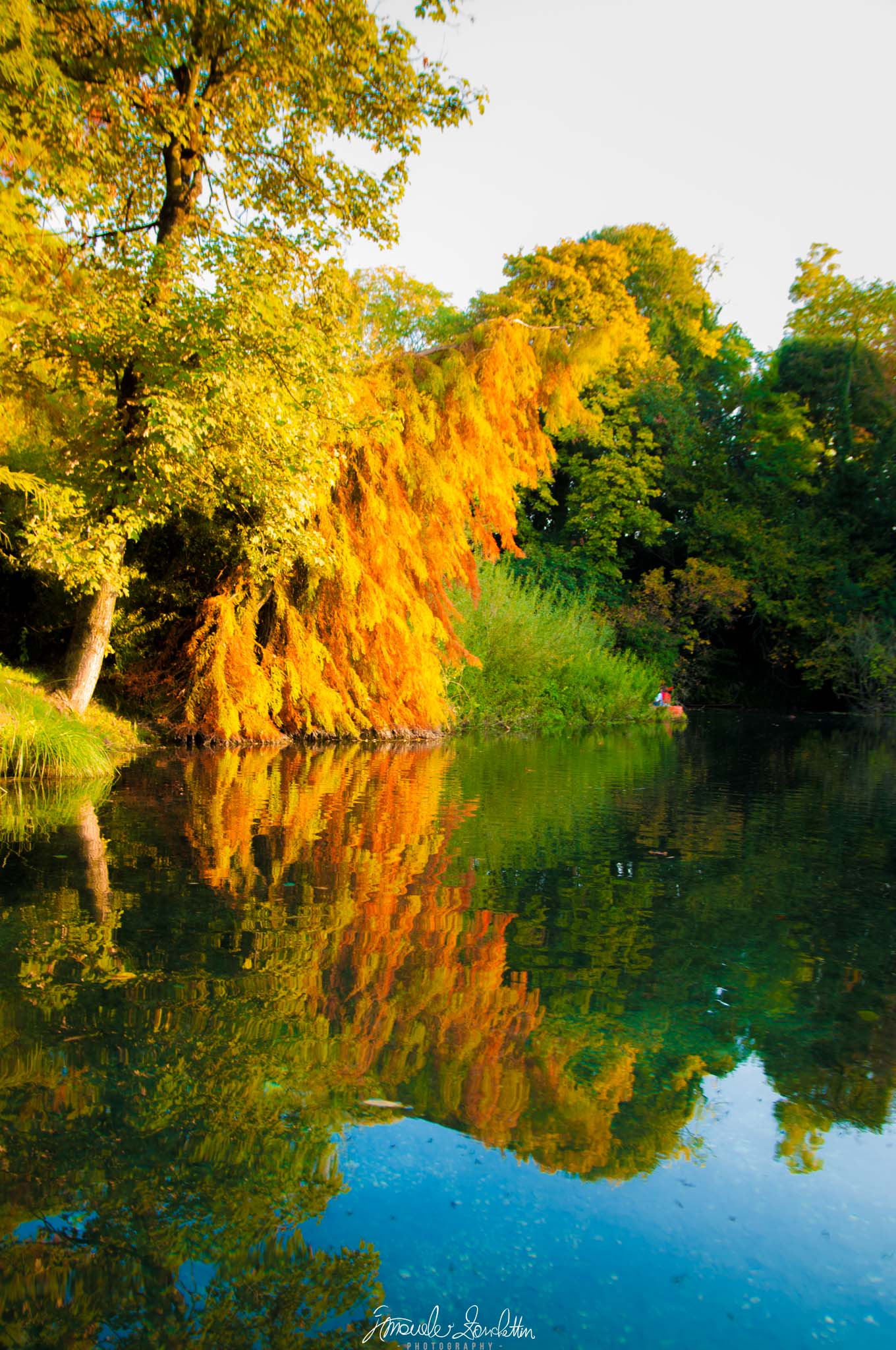
Golden foliage continues into the water, making the boundary between subject and reflection part of the story.
01 / The message
The story
I see in it.
I start with the golden hanging foliage, then follow its colour down into the water. The reflected version is less orderly, broken into small horizontal ripples. That difference makes the lower half feel like a second interpretation of the same subject.
The vertical frame gives the reflection room to matter. I enjoy how the trees seem to continue beneath the surface, while the blue near the bottom opens a quieter space. The photograph is about that visual conversation for me, rather than simply a record of colourful leaves.
02 / Technique serving the idea
Reading the
technical choices.
The supplied JPEG records 23mm, f/3.5, 1/80 sec and ISO 100. Some foliage detail looks soft in this export. I would inspect the original before deciding whether focus, movement or the export contributed; appearance alone does not settle that question.
The sky is very pale compared with the foliage. Lightroom Classic’s histogram and clipping indicators can help check those bright values. [1] I would not assume recoverable cloud detail exists, and I would keep the reflection’s role central when comparing tonal versions.
Keep & build on
A complete vertical relationship
The long format gives tree and reflection substantial space. The subject is the pair, rather than foliage with a token strip of water.
Variation in the reflection
Small ripples alter the reflected branches. This keeps the lower half from feeling like a simple duplicate of the upper one.
Colour across the frame
Golden foliage, green trees and blue water produce distinct areas that still connect. I can follow colour downwards through the image.
Question & explore
The pale upper area
The bright sky draws attention away from the water. A slightly lower framing in a future photograph could change that balance.
The small red accent
A tiny red and blue detail sits on the far bank. It adds a point of interest, but I would ask whether it supports this reflection study.
Colour intensity
The gold and blue are vivid. I would compare a gentler colour version at the intended display size, keeping the warmth without making every area equally assertive.
One practical next step
An experiment
to try.
Photograph a reflection twice from an accessible waterside position: once giving the real subject most of the frame, once favouring its reflection. Keep the horizon and edges deliberate. Describe what changes in the story before deciding which composition is more successful.
Technical references
These sources support the marked technical explanations. The composition readings and experiments are my reflections.
Readers’ thoughts
Approved comments only · Shared across the English and Italian versions